

How We Move in Clothes
The beautiful flow of 1970s suit cuts

One of the key qualities to consider incorporating into a suit is a sense of flow and movement.
Why?
When clothes have sufficient fabric placed strategically on the body, the motion of the fabric looks and feels like an extension of your own movement.
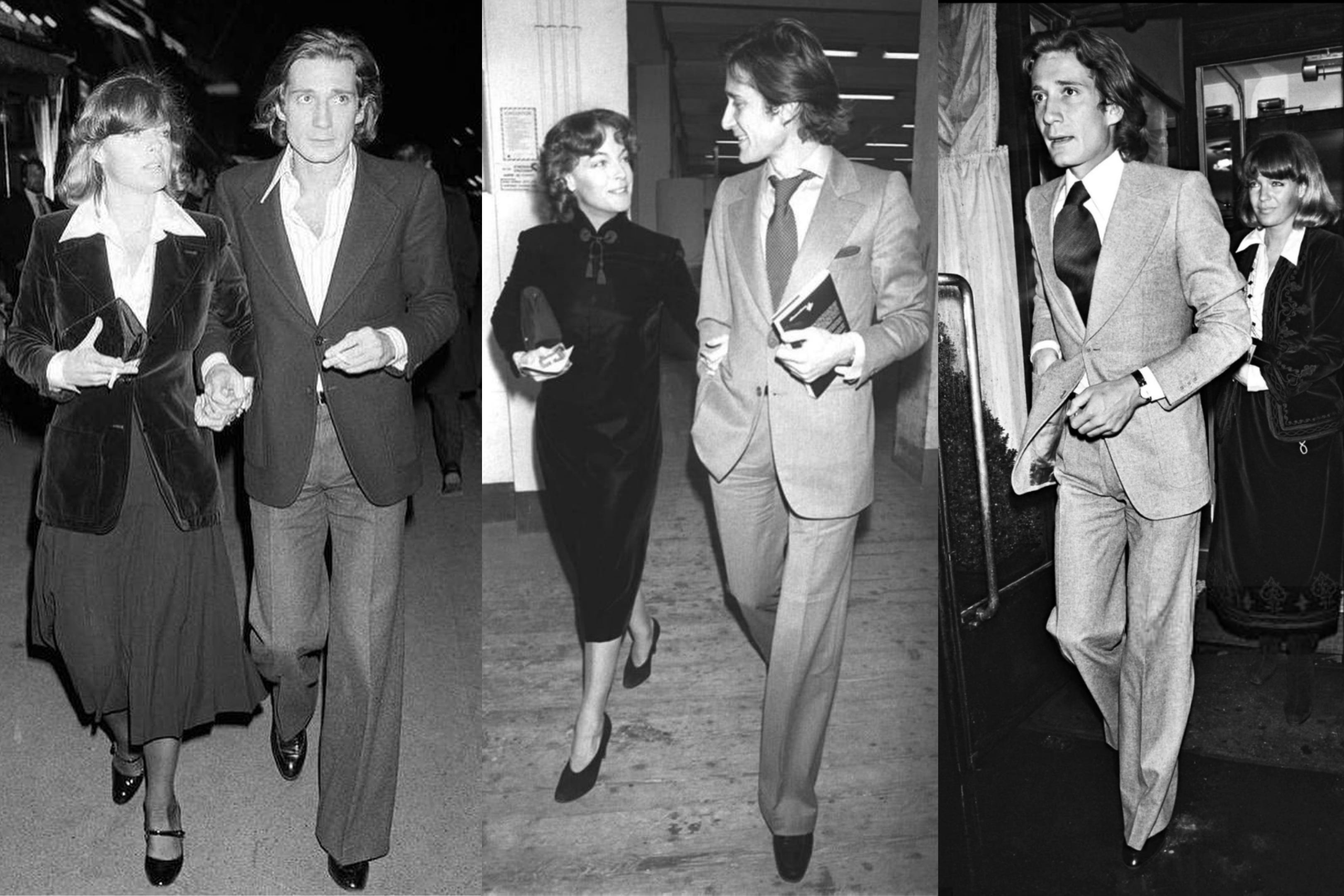
Pictured is Franco-Italian writer, Daniel Biasini in the mid 1970s wearing a distinctive style of suit that exhibits this tasteful placement of fabric. Note the length of the jacket and the kick of pant fabric at the ankle. You can picture his glide.
So what though? Glide, flow… why do we care?
Because of Connotation.
This ebb and flow implies a comfort with inhabiting your space and the space immediately around you. It suggests a comfort with being oneself. If there’s anything to convey with clothing, I’d think self-comfort would be near the top.
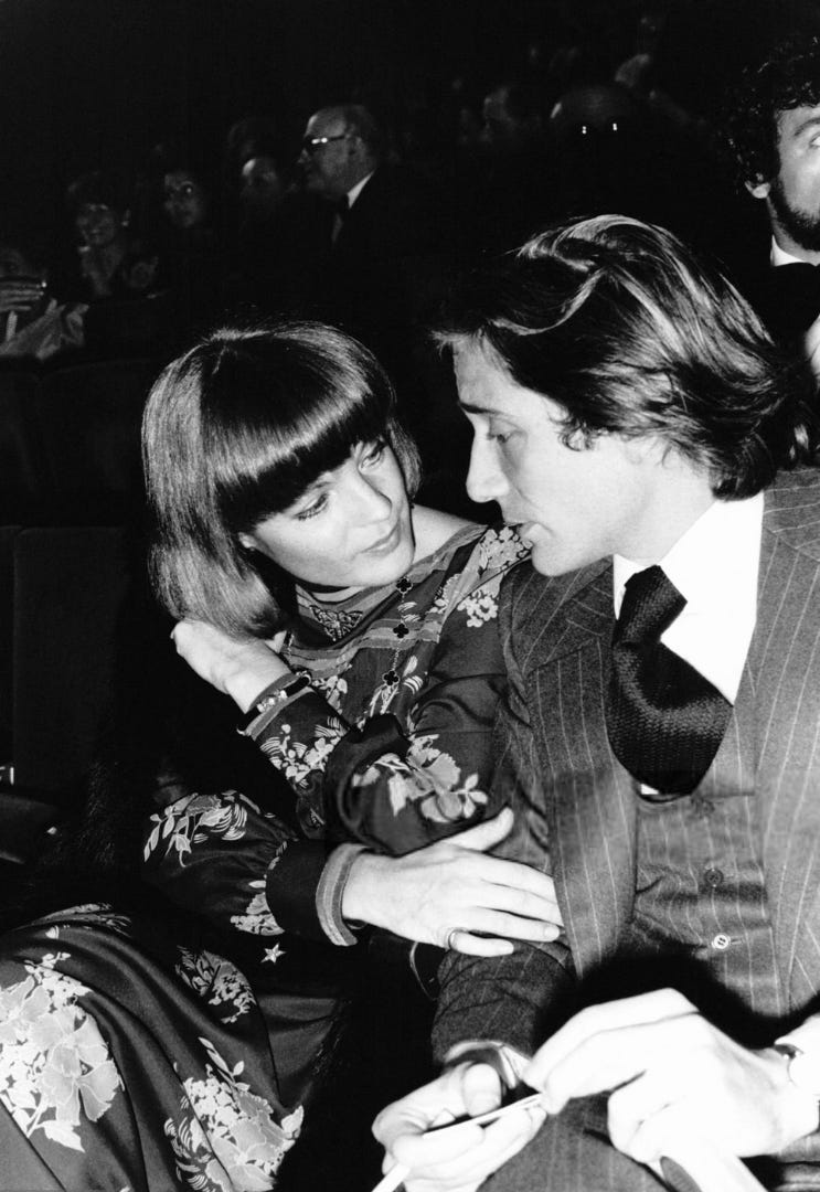
And that sense of ease and unguardedness is what I read most clearly from this set of looks. There’s natural flow and a touch of elegance. Nothing feels forced. Biasini looks refined, but without coming off as fussy or prissy. I see no posturing, discomfort or overcompensation. A lot of this may be in Biasini’s nature, but the suit design seems a perfect match for his way of being.
Backing up a bit, what interests me most in the field of style is the energy; the vibe that clothing conveys. Line, shape, pattern… every aspect of a garment will carry some meaning. So how can we apply these aspects to capture the energy we want to project? Or to draw out an energy that we feel is already within us? How do certain design gestures translate to a feeling? This is why I talk of qualities, dimensions, and energy in clothing first.
Feel and Flow of the Suit
Let’s talk some specifics as I understand them. Biasini avoids strong patterns in the suiting, allowing the beautiful lines of the cut to sing without distraction.
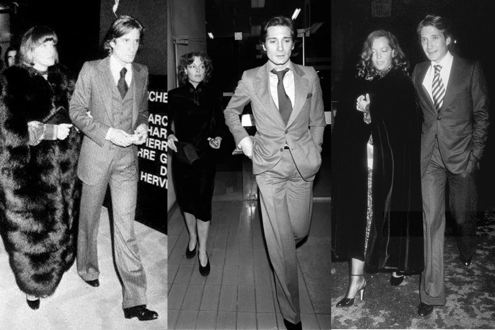
Visually, the bones are in the right place. The suits are slim through the waist with the the buttoning point right at the natural waist. The broad lapels imply a sense of presence through generous use of fabric. Shapes appear balanced and the overall effect of the lines is to elongate.
Long jacket, high vents
The jackets have a strong shoulder, slightly extended, so you get some good hang of the fabric.
What’s not visible in these pics are the rear vents and flaps. The long and leafy silhouettes of the 1970s featured high vents with a slightly flared flaps lending a sense of fluidity and grace with movement.
Check out the motion of the flap on Roy Scheider’s suit in this scene from the Marathon Man, 1976.
Trousers extend to the floor
Trousers fall cleanly with no clinging to the leg. They’re cut wide and straight with no taper, so there’s a kick in every stride.
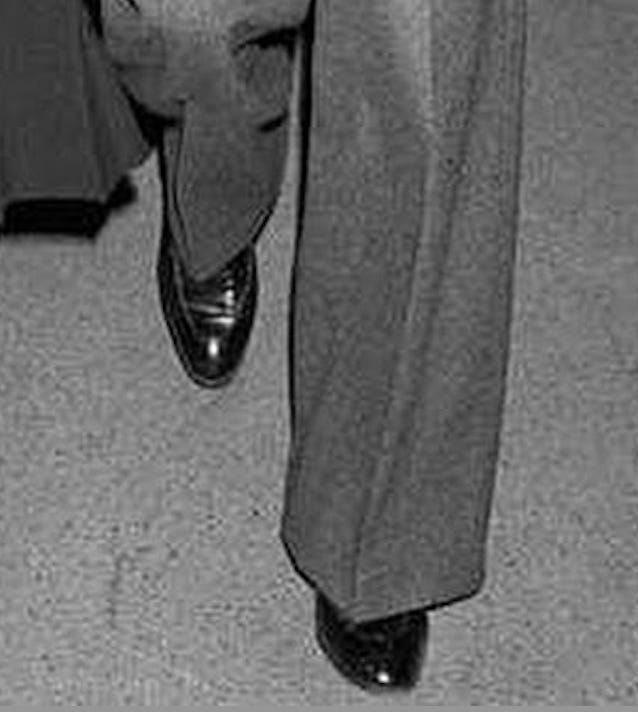
A note on break. We’re not talking about “break” as we would with trousers having a narrower or tapered shape. If the leg opening is large enough, the hemline can sit quite low on the shoe without bunching, pooling or breaking. So you get this clean, uninterrupted, columnar leg line that extends very close to the floor, visually elongating the legs.
But more than that, if you think about shapes of the figure in context, broad straight cuts or flares will appear to ground you with purpose. You want to appear to have a healthy relationship with ground. It seems to me that the nature of a man’s suit is to provide presence. part of that is having a strong relationship to where you are standing. Solid legs can do this in a way that slim, short trousers won’t.
Looking backwards… it was forward
To my eye, this cut of suit is beautiful, understated and elegant. It flows, but there’s restraint. It captures the more ‘socially forward’ energy of the times when men were comfortable being seen… and being seen as visually desirable.
On a side note, it’s interesting how the longish flow of men’s hair styles of the 70s complemented and echoed the lines of the era’s suits.
Really informative and insightful article Patrick